1. Because You Actually Want to Make an Impact
Let’s be honest — you’re not here to blend in. You want to create something meaningful, something that lasts. A thoughtful logo paired with a clear brand story sets the tone for everything else: influence, connection, and legacy. It’s how you go from being seen to being remembered.
2. Because Clarity Beats Noise Every Time
There’s a sea of copycats and Canva-made lookalikes out there. A custom logo and story give you clarity — visual, emotional, and strategic. It tells people what you stand for before you ever say a word. That’s how you cut through the clutter.
3. Because People Don’t Just Buy Products — They Join Movements
Whether it’s a soap company, a nonprofit, or a digital platform, the best brands make people feel something. When your logo and story line up, you invite people into something bigger than a transaction. You invite them into your mission.

When the Ordinary Reveals the Sacred: REVEALED Transformation
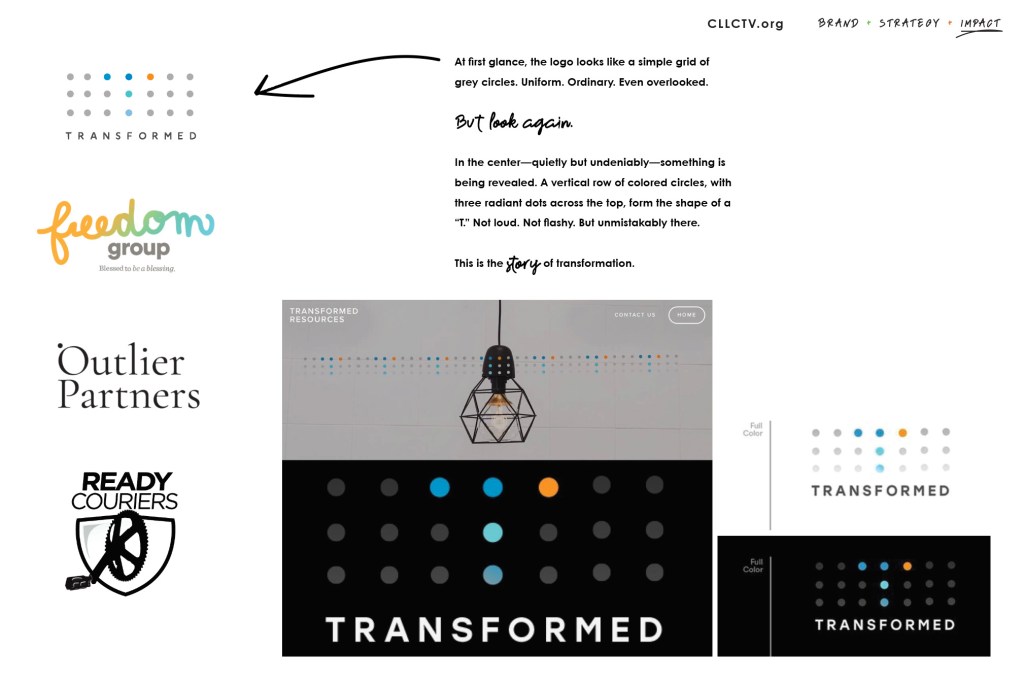
At first glance, the logo looks like a simple grid of grey circles. Uniform. Ordinary. Even overlooked.
Look again.
In the center—quietly but undeniably—something is being revealed. A vertical row of colored circles, with three radiant dots across the top, form the shape of a “T.” Not loud. Not flashy. But unmistakably there.
This is the story of transformation.
Not instant. Not easy. But real.
Each circle in the logo represents a moment. A season. A struggle. A surrender. The grey circles speak to where many of us start—numbed by life, stuck in routine, hidden in plain sight. But the colored ones? They tell a different story.
They represent the change that is possible.
The healing that happens slowly.
The clarity that emerges one area at a time.
This logo reminds us that transformation doesn’t shout. It shows up. In the middle of the mess. In the quiet rows of everyday life. And through Christ-centered soul care, what once felt stuck becomes a new story of freedom.
No matter who you are.
No matter what you’ve walked through.
Transformation is possible.
Visual Identity & Storytelling Framework
Focus: Logo, Brand Concept, Messaging Clarity
Overview:
We partnered with Soul Care International to develop a new identity for their Transformed Resources initiative—an equipping platform designed to walk leaders through soul-deep transformation, one person and one area of life at a time.
Creative Solution:
The final brand mark features a layered dot pattern—each dot symbolizing a life, a moment, a shift—slowly converging to reveal a subtle, radiant “T” in the center. It’s more than a logo. It’s a visual parable of spiritual growth: slow, sacred, powerful. Transformation doesn’t arrive all at once—it emerges, layer by layer, as we surrender to the process.
Impact:
Sparked new cohort interest and speaking invitations after unveiling
Unified brand identity across digital, print, and resource guides
Immediate resonance with counselors, pastors, and soul care leaders
Larry Lundstrom
Founder, CLLCTV.org
Innovating for visionary leaders.
thechurchhub.org | brainypixel.com | lighthouse AW
